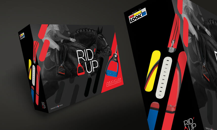
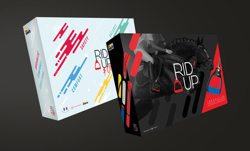
Rid’up (www.rid-up.com), a new entrant in the horse-riding stirrup market, entrusted us with all of his communication (name, logo, website, POS …) as well as the packaging of its products. The packaging of the stirrup “Plus”, intended for adults, has a design that we wanted sober, elegant, according to the world of riding. So the background color is black, as is the horse in full jump which appears on the cover, mounted by a horsewoman in gray tone. The caliper, it appears at the bottom right of the packaging (end of the reading direction) on a red background, for better visibility and storage. The logo of the brand is placed in the middle of the lid to impose the mark.
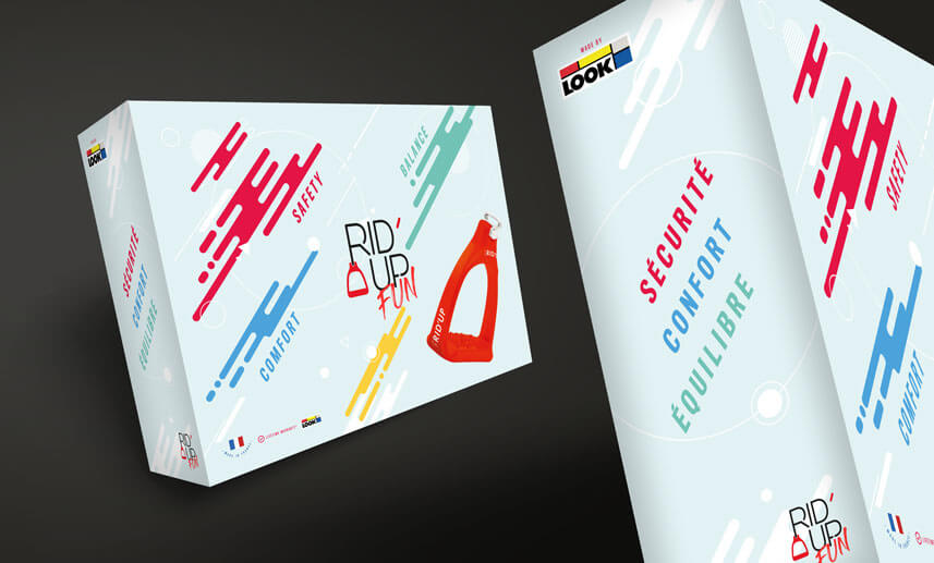
The stirrup “Fun”, intended for a younger audience, has a packaging that corresponds to it. Light blue in color, it is embellished with graphic shapes in bright colors. The word “Fun” in a brush type font is added to the Rid’up logo, always in the center of the cover.
Category:
Packaging-Stand-PLVDate:
December 12, 2019